We love designing logos and the visuals to brand companies. For us it requires team work with the marketing, sales, or creatives asking us to take the work on.
Here are just a few we have designed. All clients are invited to be very involved in expressing nips and tucks to the look and bring their opinions to the table.
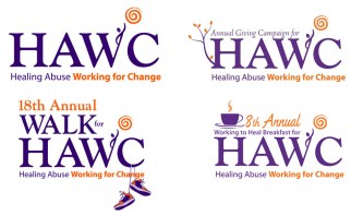
Logo for Healing Abuse
Working for Change (HAWC)
When HAWC wanted to shift and use their new name in branding who they were becoming, We collaborated to run a logo contest. While there were many good ideas, most did not align with the look and feel they were looking for. One design submitted had some possibilities however. So Kishgraphics went to work developing around that idea. Subsequently, we created the main logo of a human being reaching for the sun’s light. From there we have been able to hold the consistency of the logo, and develop ideas around it for various events and fundraisers.
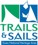
Trails & Sails Event by Essex National Heritage
Trails and Sails is a yearly event showcasing the Essex County region of Massachusetts Historic venues, hiking trails, sailing opportunities and so much more. The idea was to find a way to effectively incorporate the land and sea element. So we looked at the familiar angles of the trail and the sail and went from there. This was developed in 2006 and is still used.
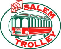
The Salem Trolley
The Salem Trolley wanted to refresh their logo keeping some similarities of the past and sprucing this up with brighter colors. We illustrated the trolley totally over and chose brighter reds and greens so it pops more.
 Boston Electronics
This company’s marketing and sales director was someone we worked with at another company when they wanted to design their logo. Boston Electronics had nothing. There stationary and materials were all still old clip art and looked like a 1950’s company. The new marketing director was looking at creating their presence at trade shows and wanted the company to look as wonderful as they are. We developed their stationary designs, and trade show banners. In evaluating their needs as we went along, we chose to create both a stacked text and single line for a variety of uses that included putting the logo on potential equipment and trade show give aways.
![]() Life Bloom Massage & Spa
Life Bloom Massage & Spa
The request was to create something fun, calming and relaxing. The owner of this lovely place is very precise in how they like things. After a number of sketches…yes we still use paper and pencil, we settles on these two fonts classic Helvetica Regular and Thin as well as Refreshment Stand with a lotus flower as part of the lowercase o. At the same time what worked great is that Helvetica aligns easily for creating tight exact alignments.
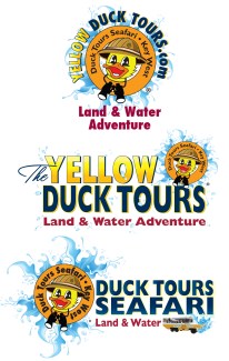
The Yellow Duck Tours
This company was in Key West and was part of a corporate collective of a tourism transportation group. They wanted it to express the notion of being splashed and using a duck for their character. They saw their business as a safari on water so the life saving ring was placed on the character. Bright colors were needed so the logo could be spotted on land and in the water.
It took a few twists as the company played with the name, and the feeling needed to be the same, fun and engagement.
